YAM works across the disciplines of design,
art direction and typography for clients
in culture and commerce.
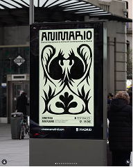

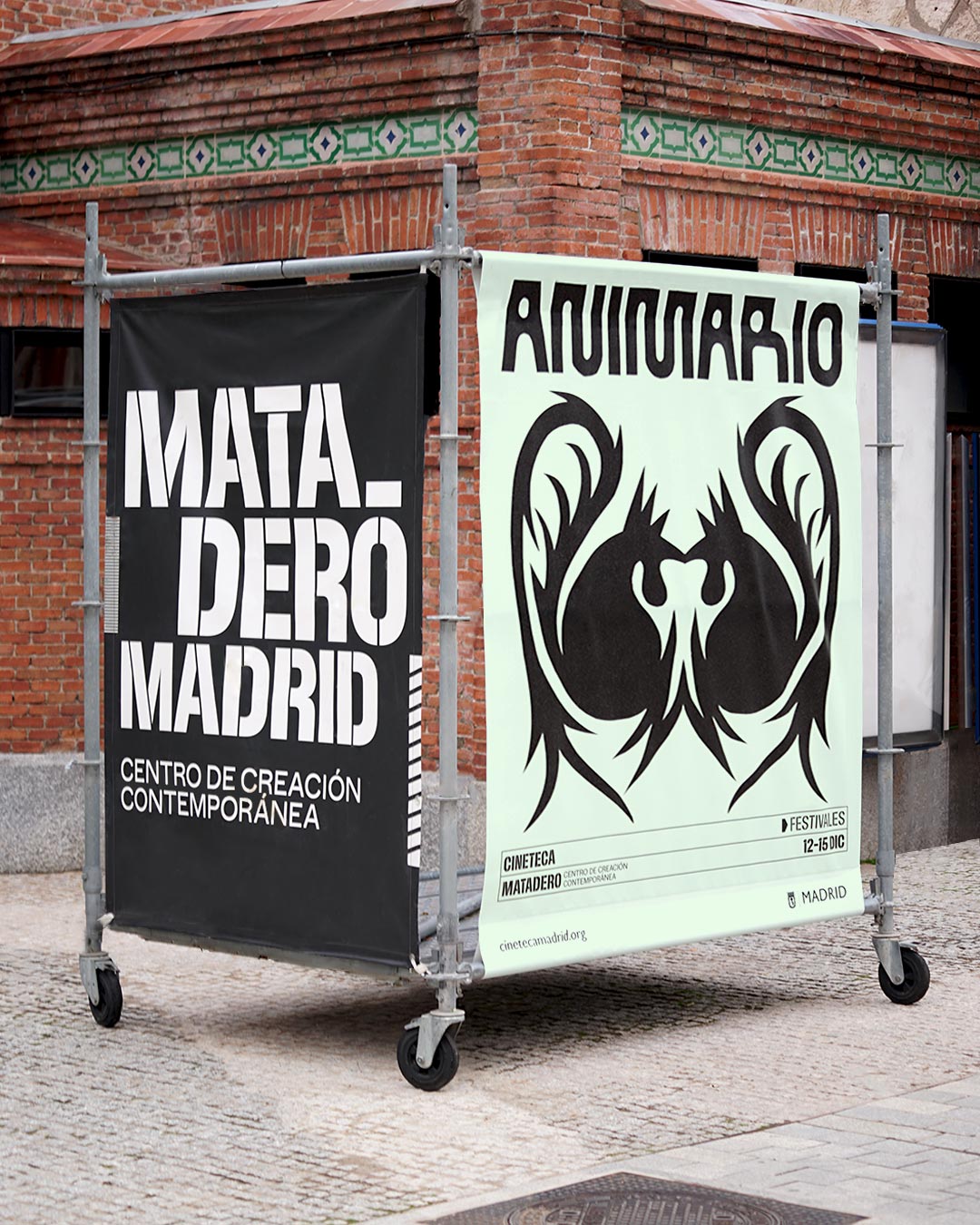
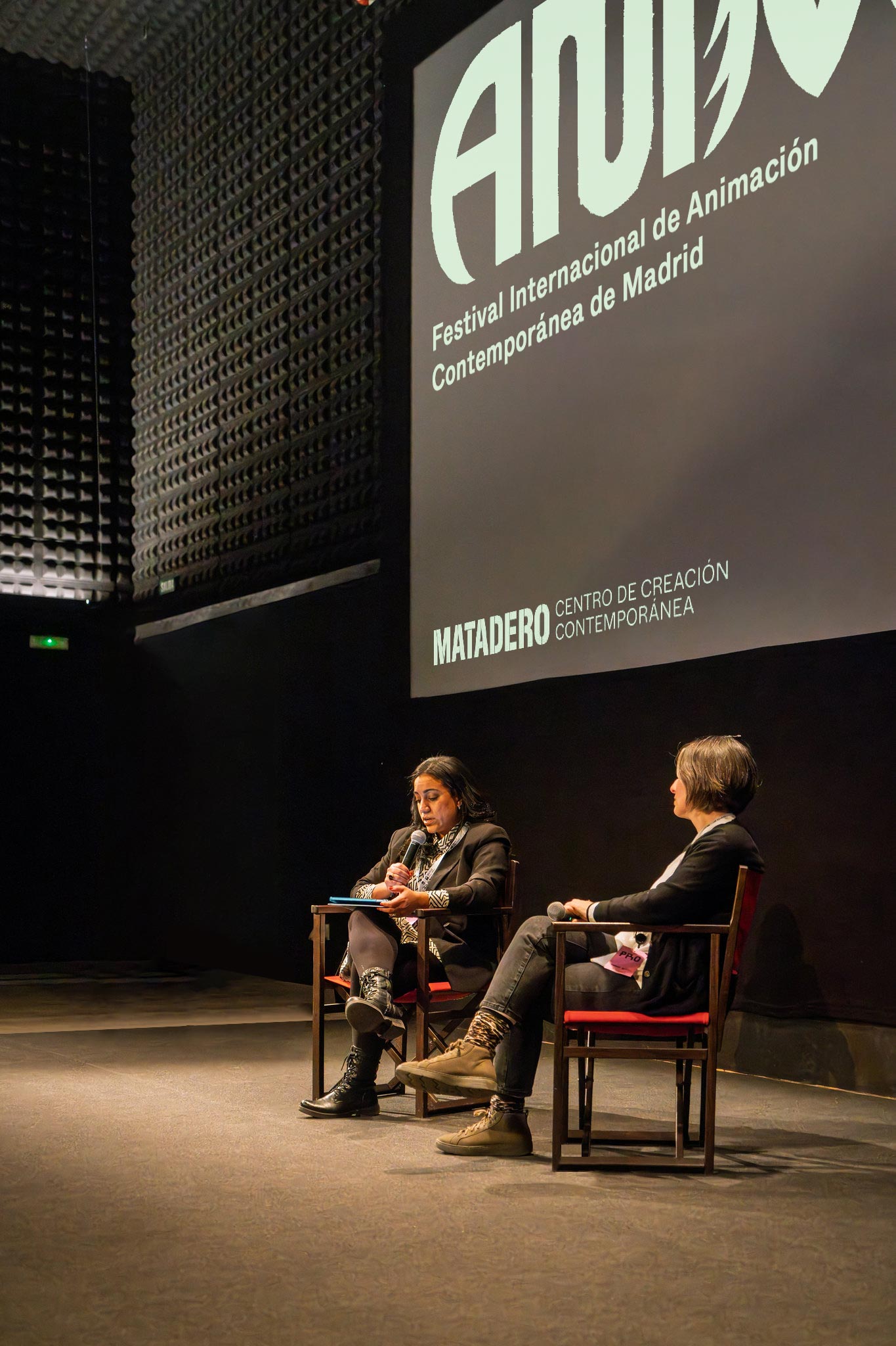
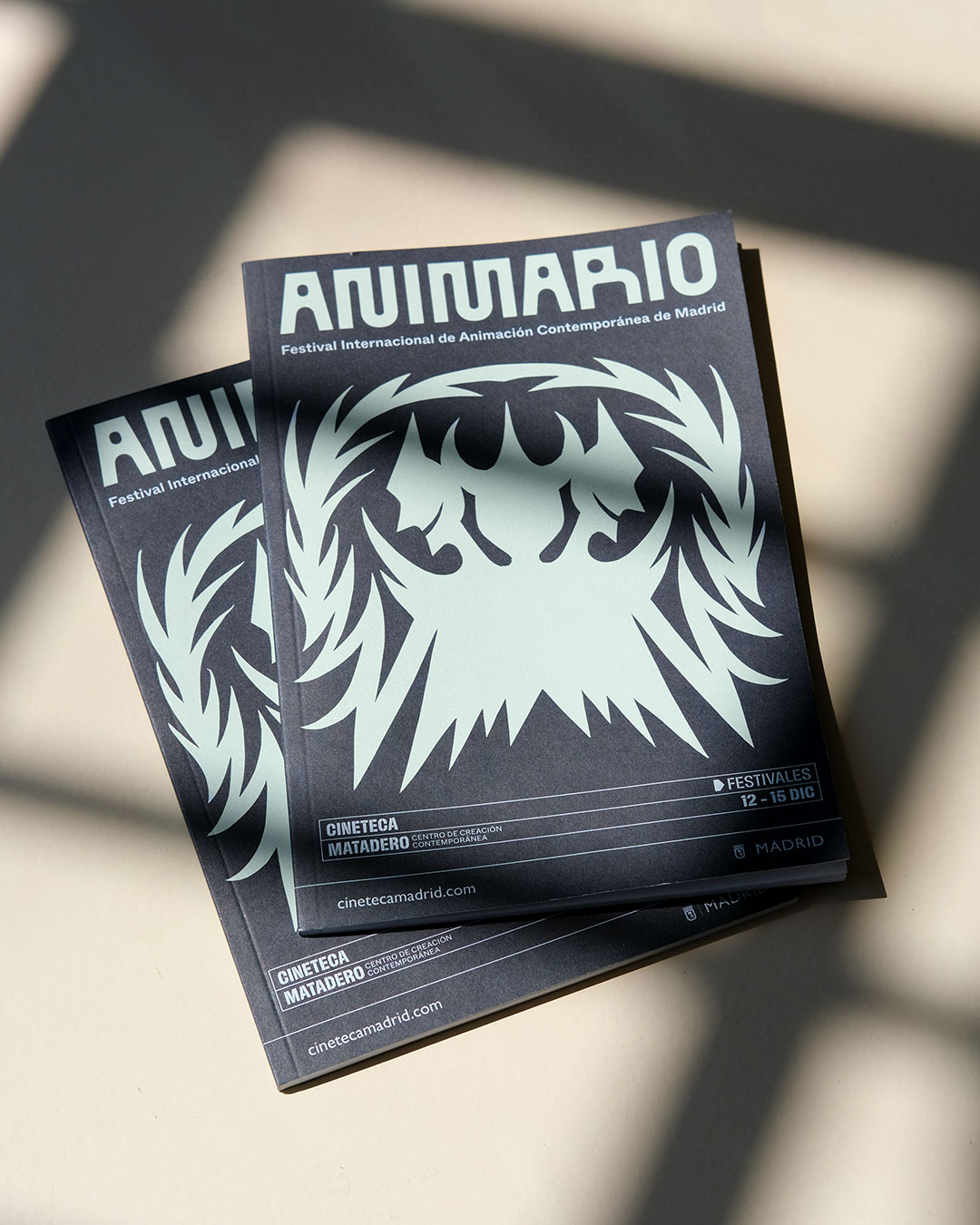
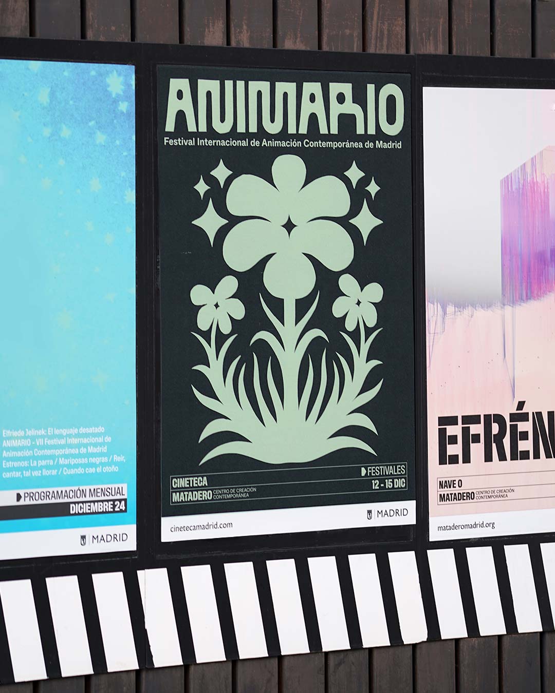
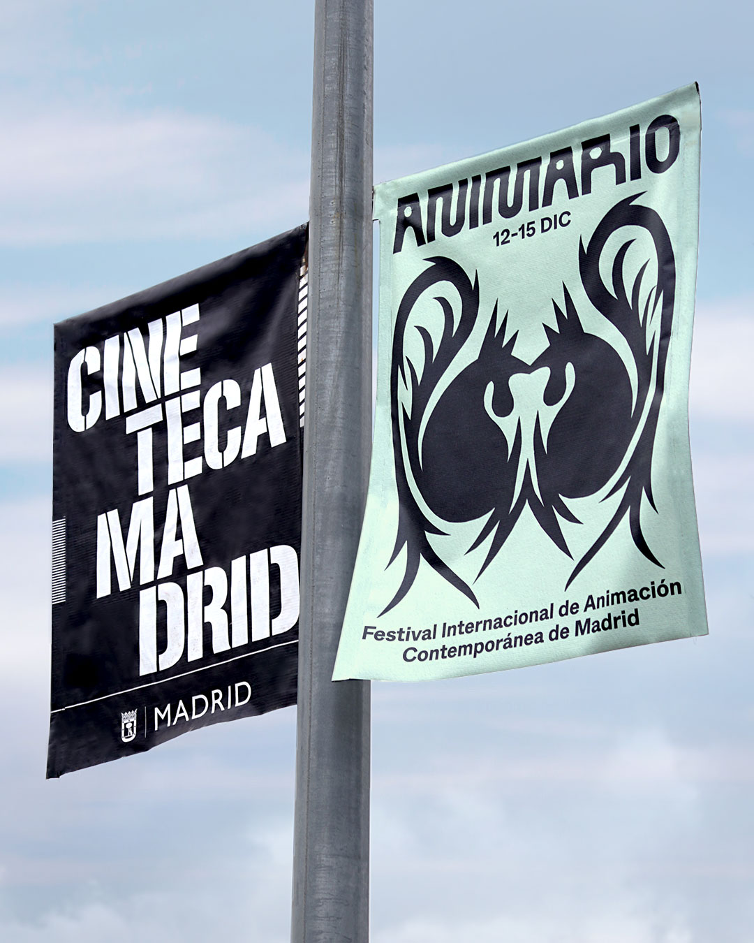
Identity for ANIMARIO. Organized by
@cinetecamadrid
and
@mataderomadrid,
designed in collaboration between
@victor.clemente_,
@alfonso_yordi,
@emmegu
and
@jaidelcorro
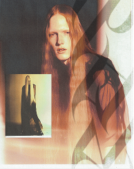
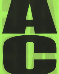
ANIMARIO is the international contemporary animation film festival of Madrid, with Poland as its
invited guest country for the 2024 edition.
This year’s graphic identity is inspired by ‘wycinanki’, a traditional Polish art of paper cutting
born in the XIXth century. It involves creating intricate designs by cutting and layering paper,
through which families depicted their daily lives and decorated interior spaces. The term comes from
the Polish verb “wycinać,” which means “to cut out”.
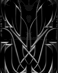
Parting from this research, the visual identity aims to bring a traditional technique into a
contemporary language, mixing the rural and the fantastic, history and modernity.
Music score by the wizard
@pb___sr
Special thanks
@mario__cano__
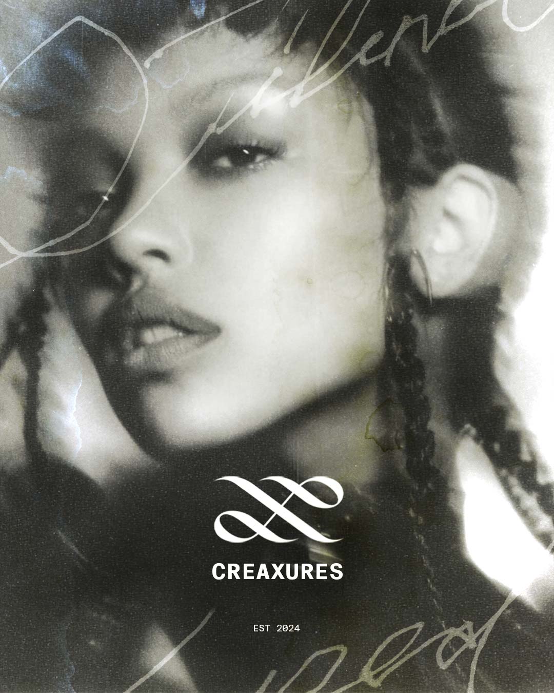
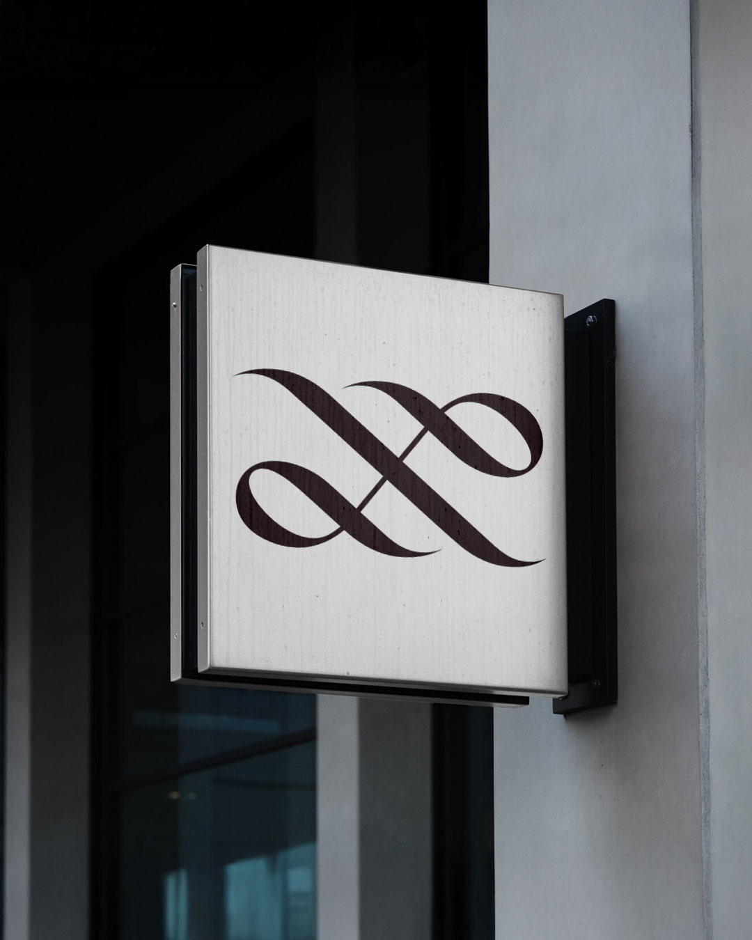
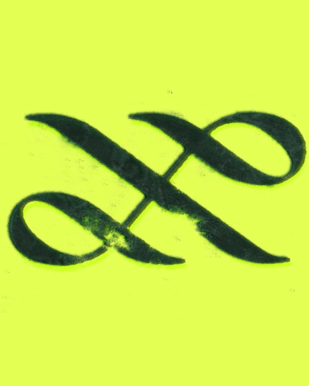
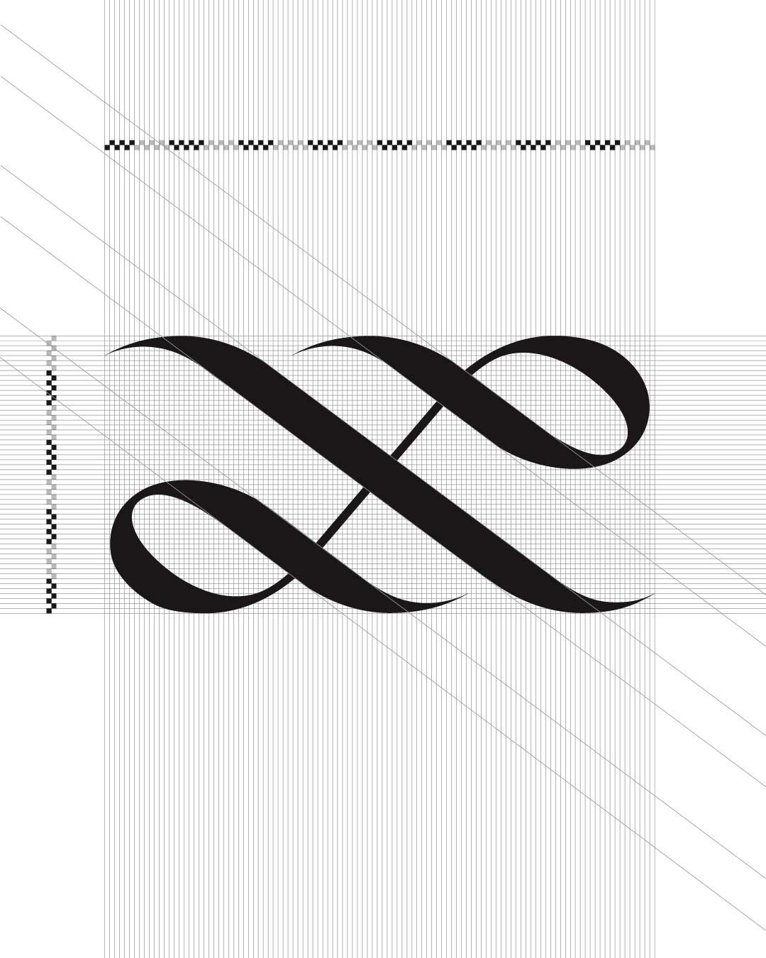
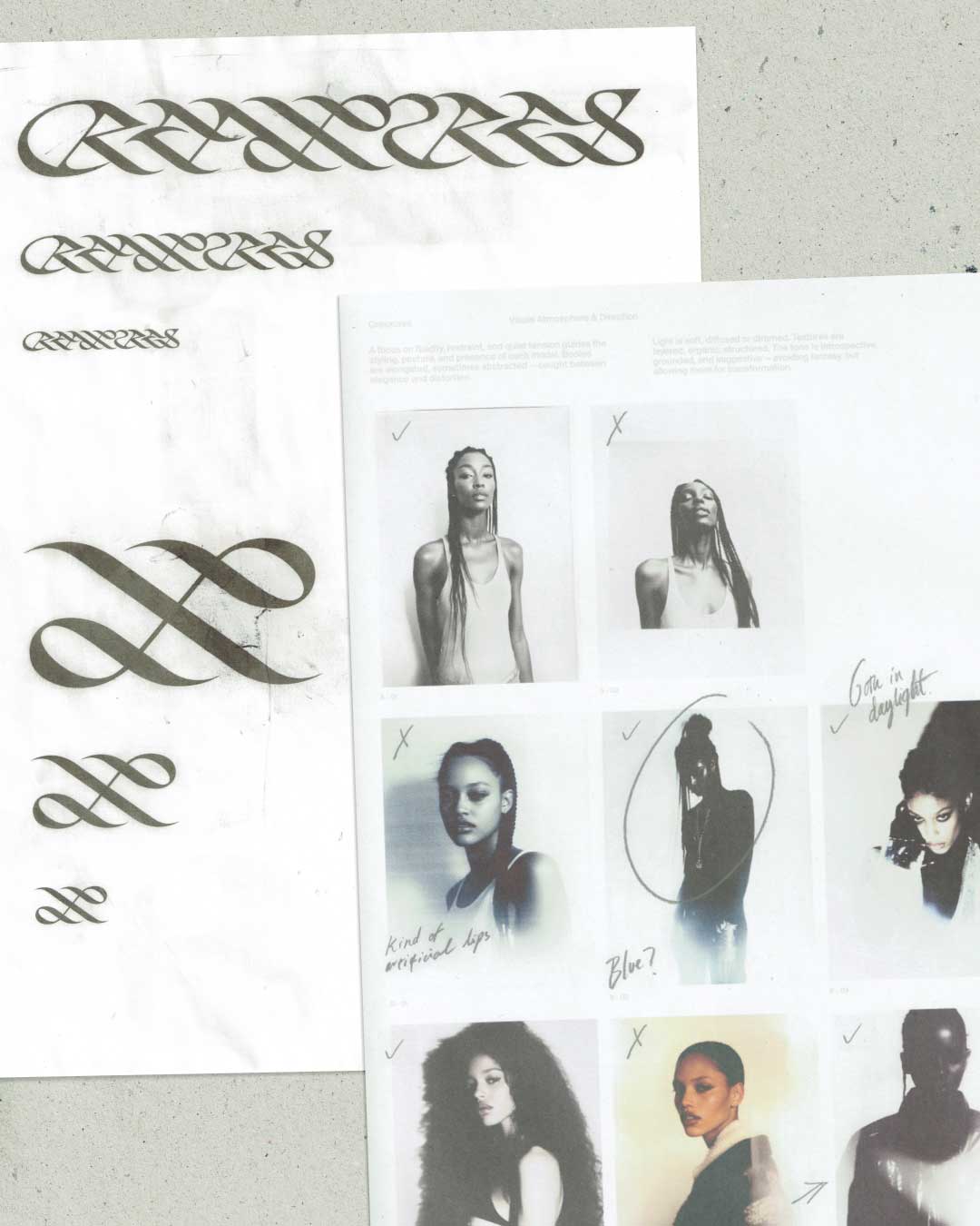
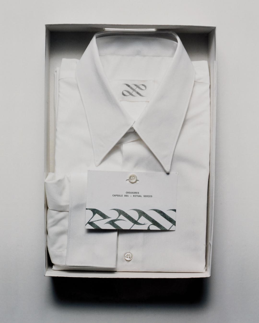
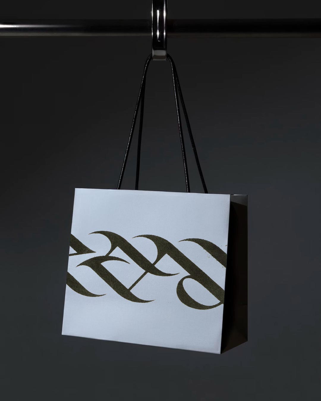
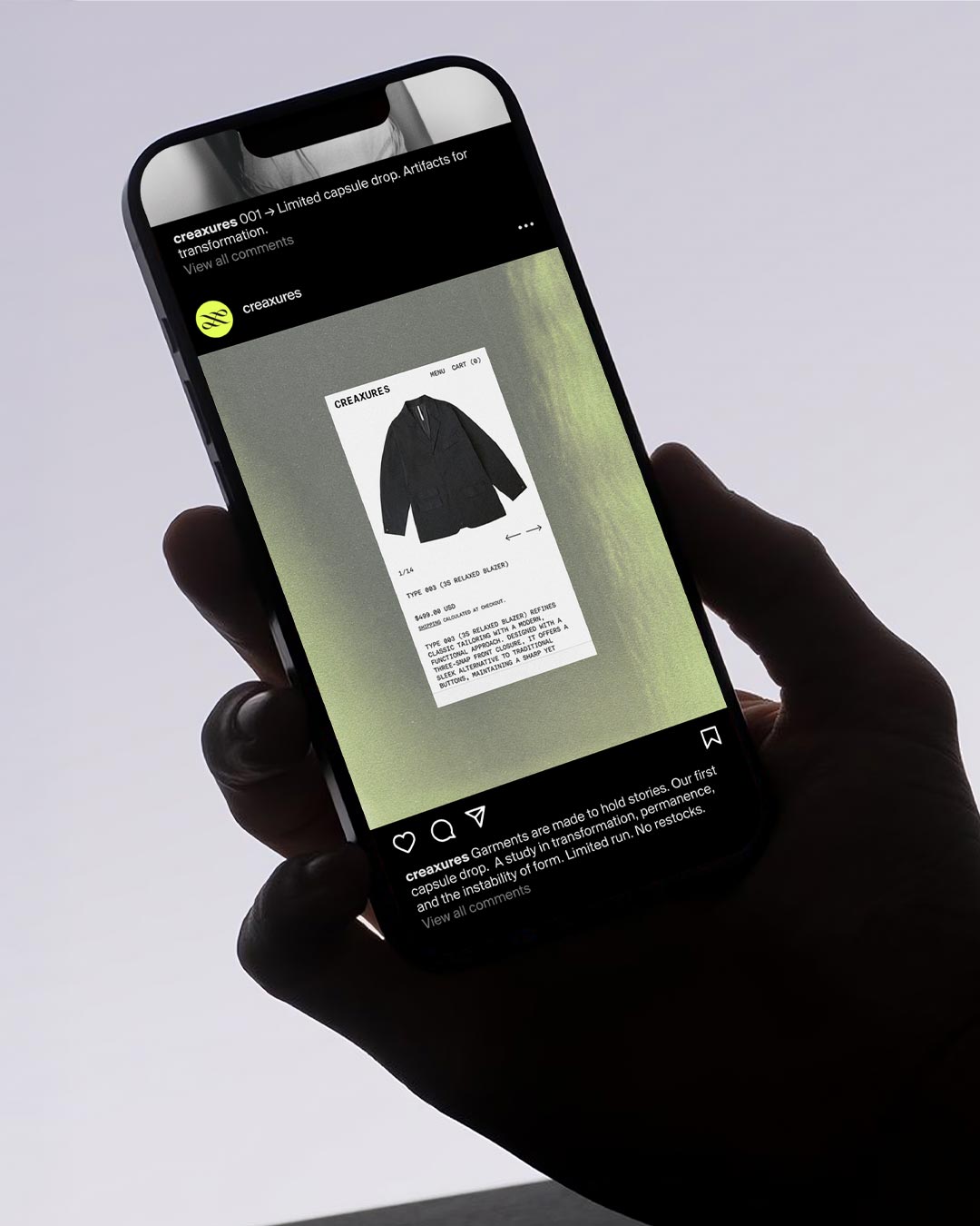
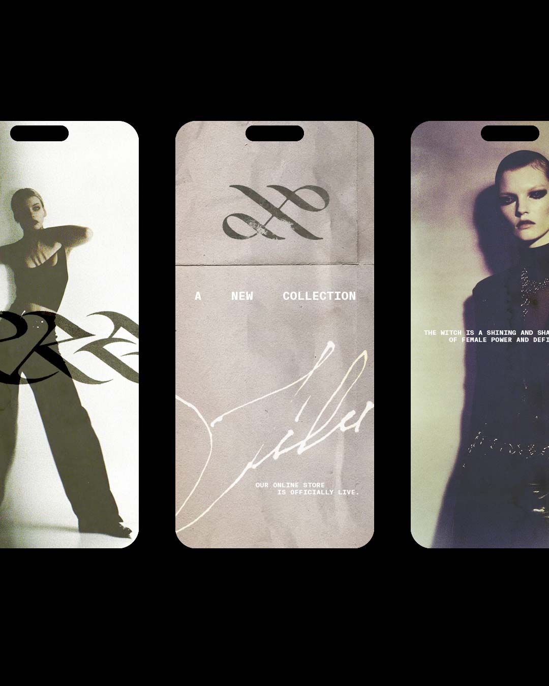
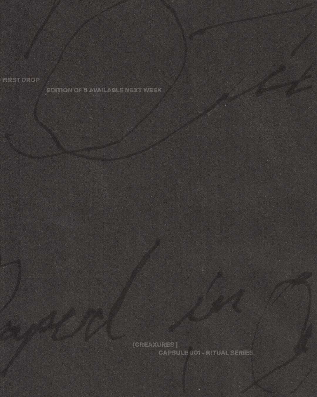
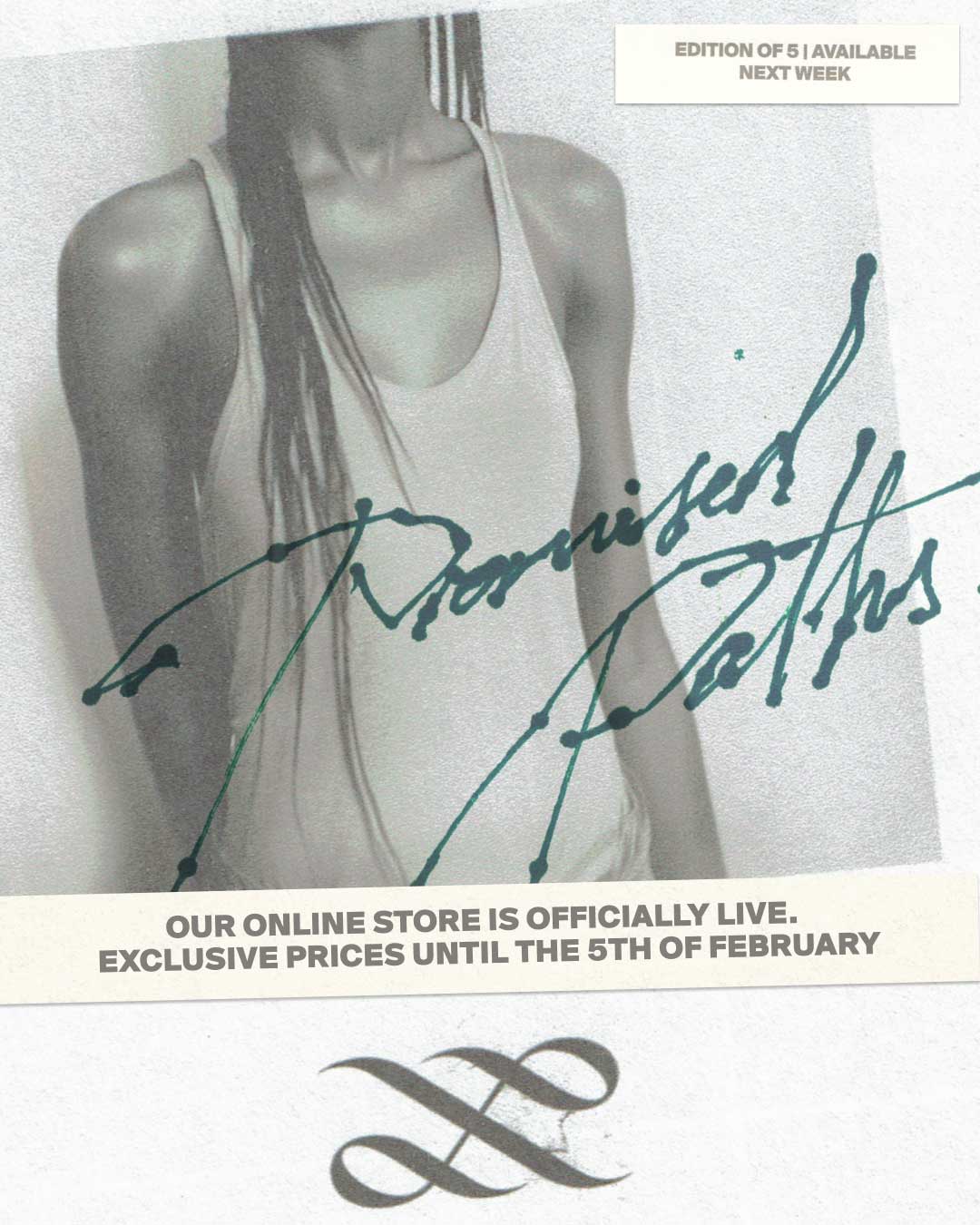
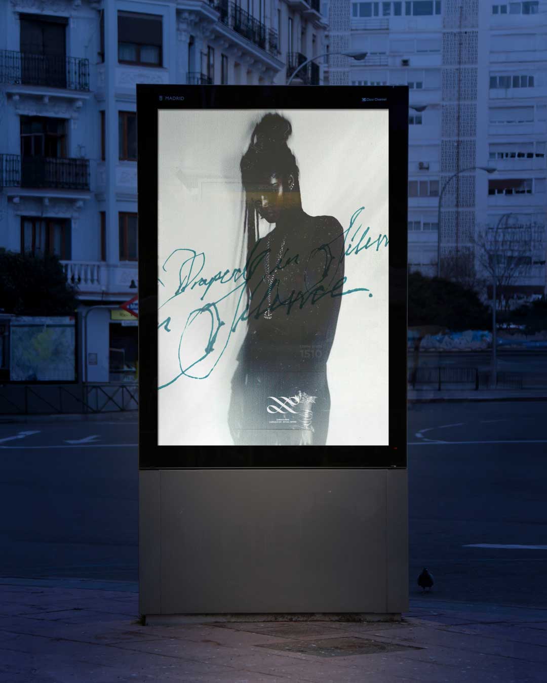
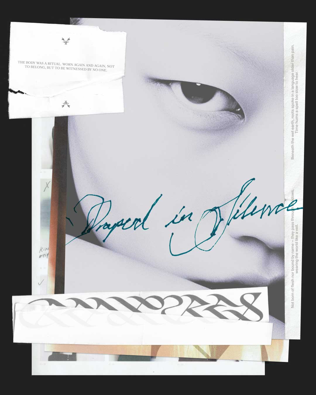
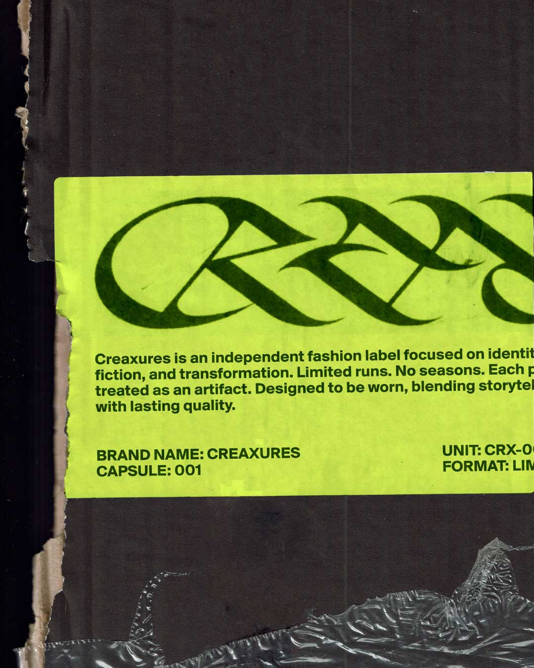
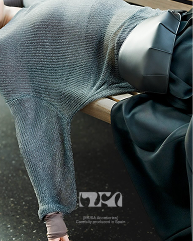
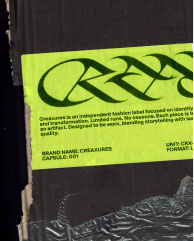
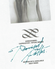
Visual identity and logo design for CREAXURES. Commissioned by an emerging fashion label based in
Indonesia.
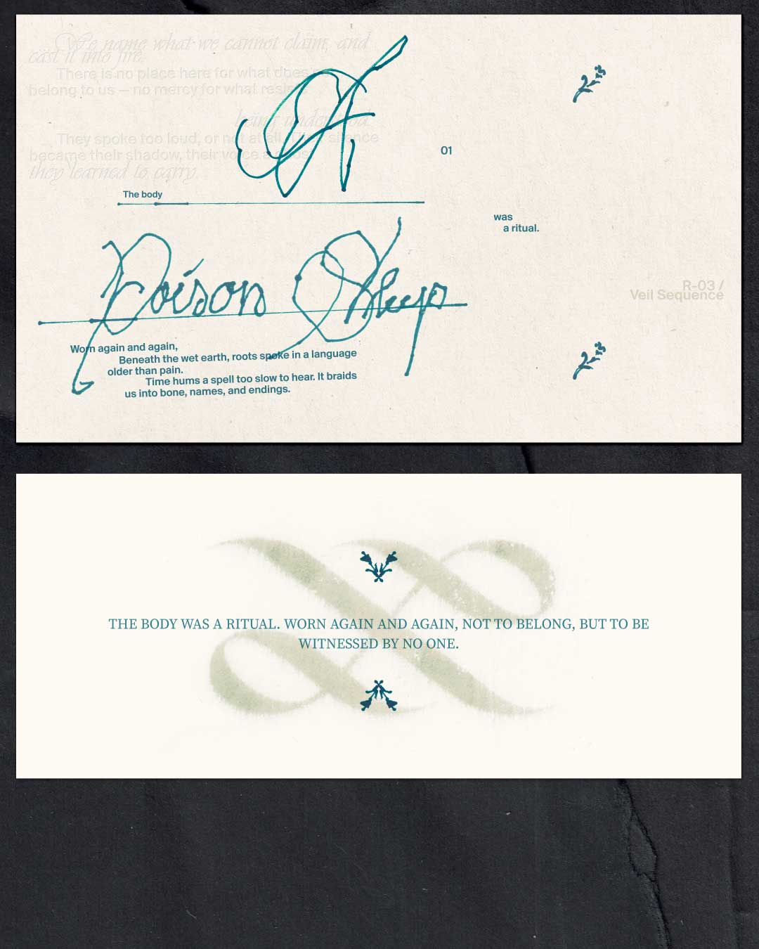
Creaxures was conceived as a clothing brand built around transformation, alter egos, and the idea of
garments as living entities. The brief explored the tension between structured workwear and personal
freedom, proposing a character who redefines how to dress and exist across both worlds.
Building
on this, the visual direction introduces a subtle layer of symbolism and ritual —treating clothing as
something worn with intention, almost ceremonial. The project focuses on a custom wordmark and a
flexible system that combines sharp, controlled forms with moments of distortion, alongside textured
scans and handwritten elements. The result is a brand that moves between elegance and experimentation,
balancing luxury, underground culture, and a more instinctive, almost sacred approach to identity.
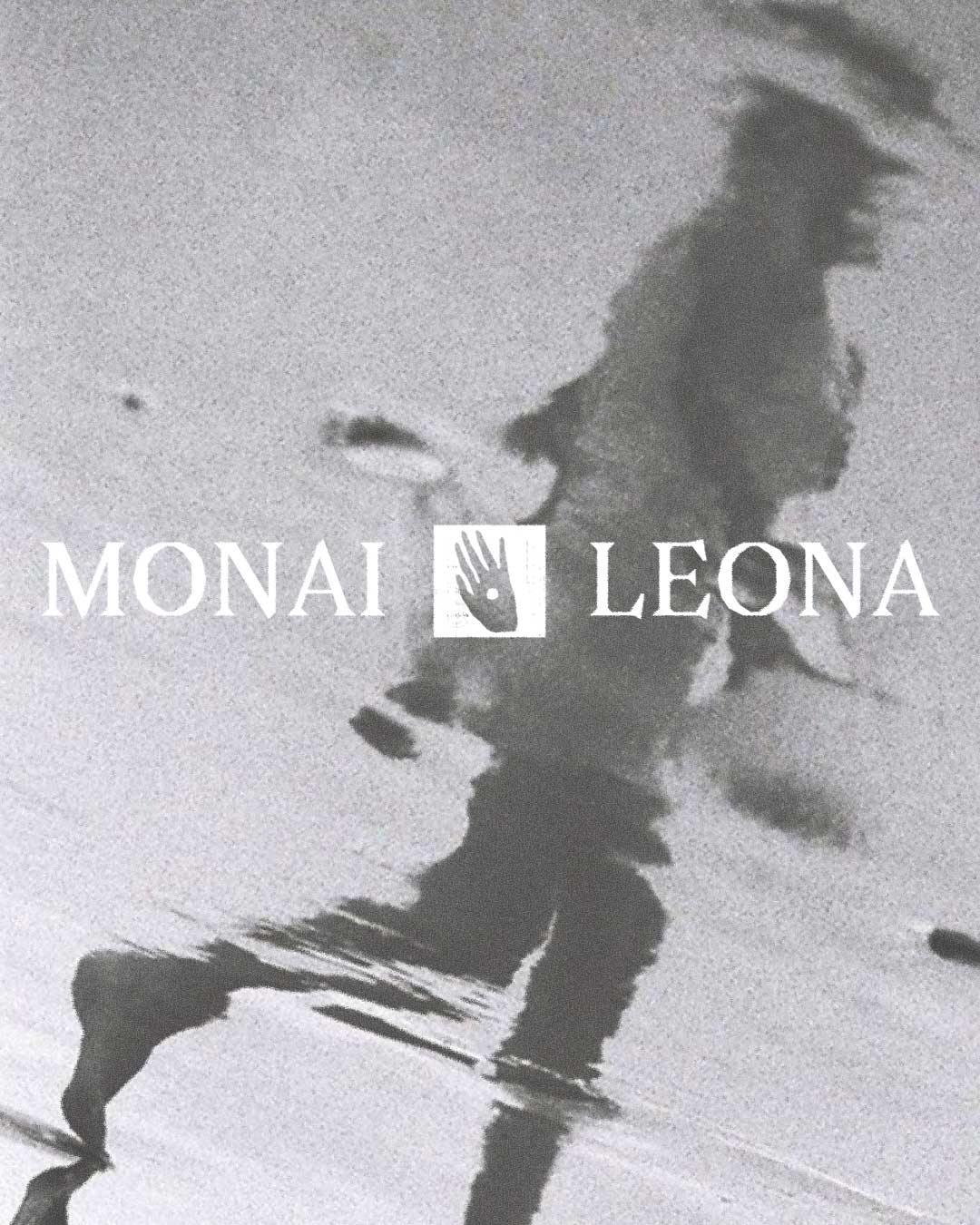
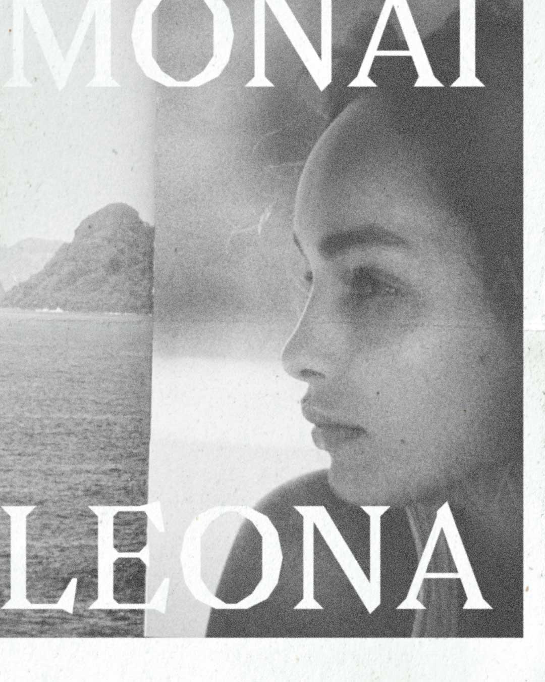
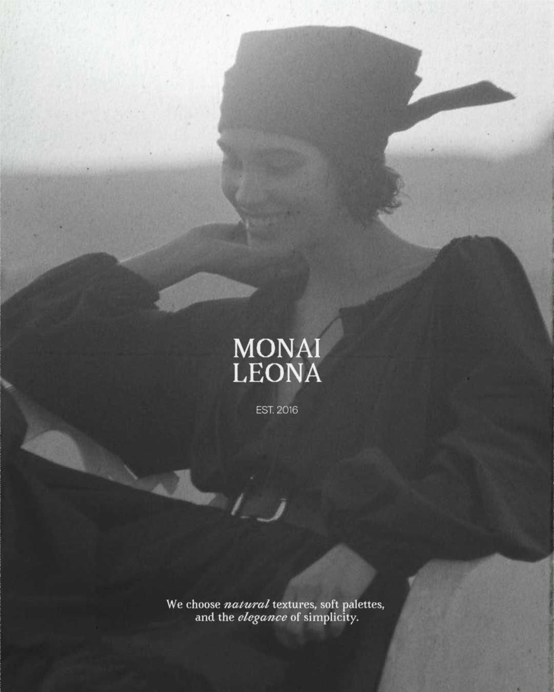
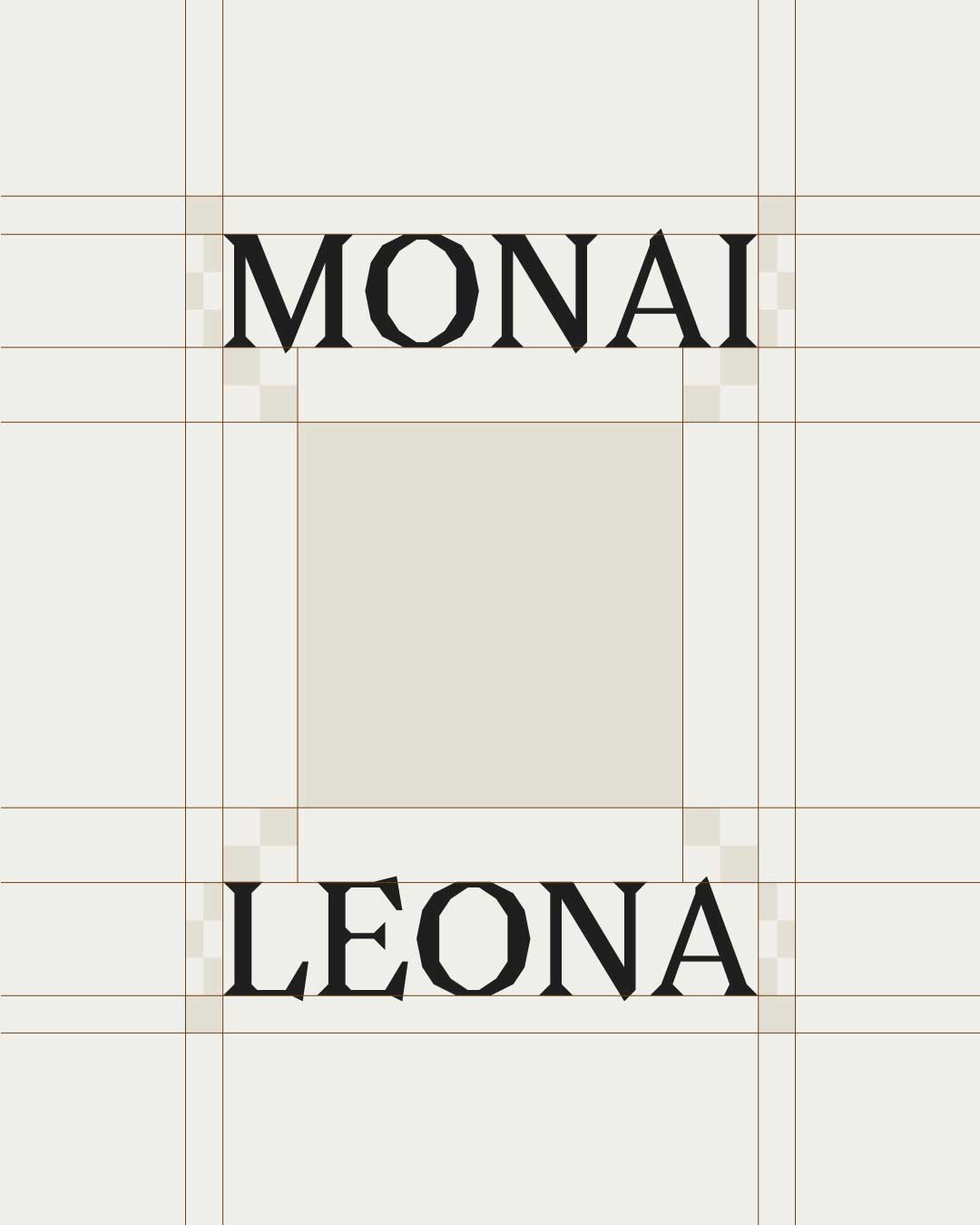
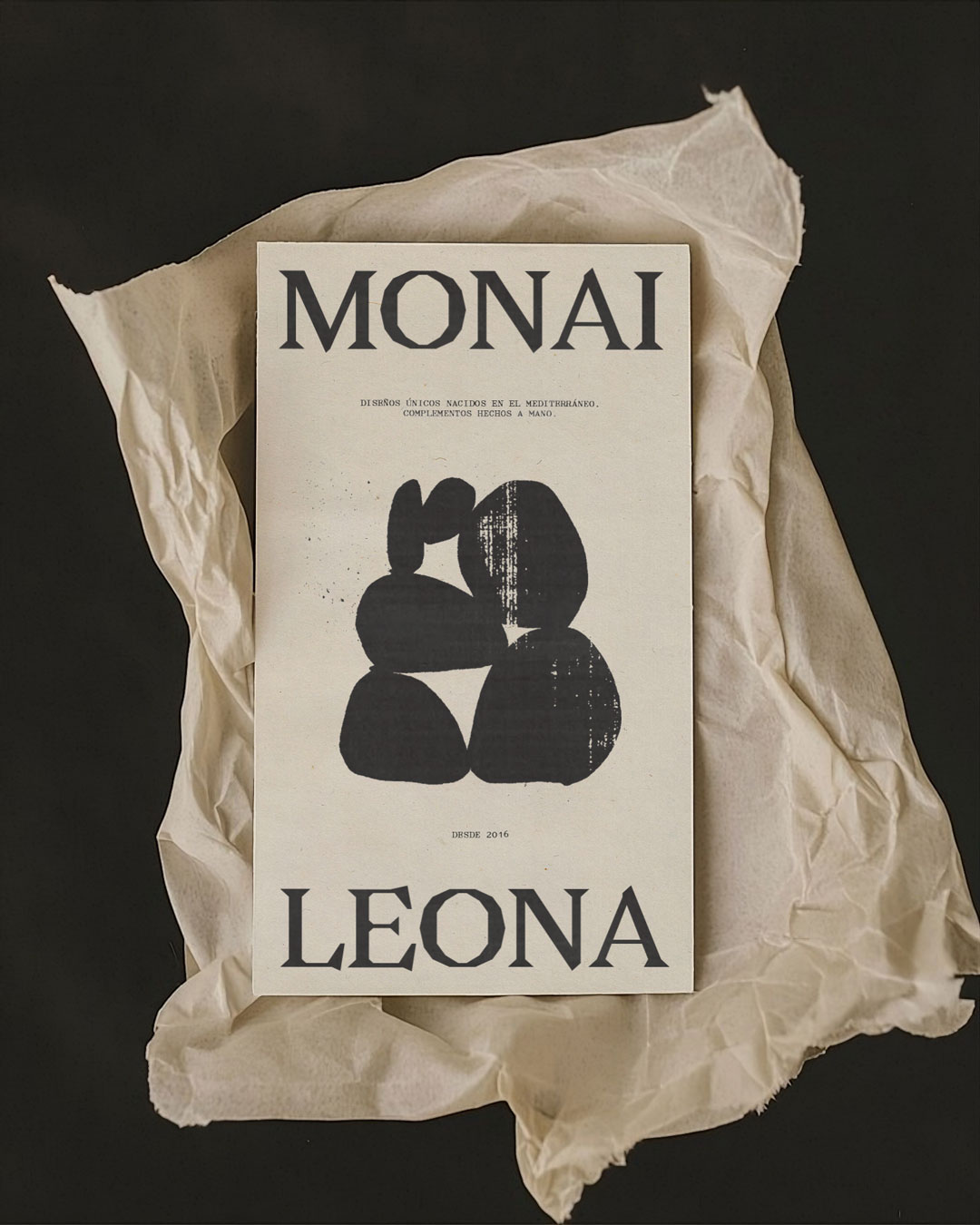
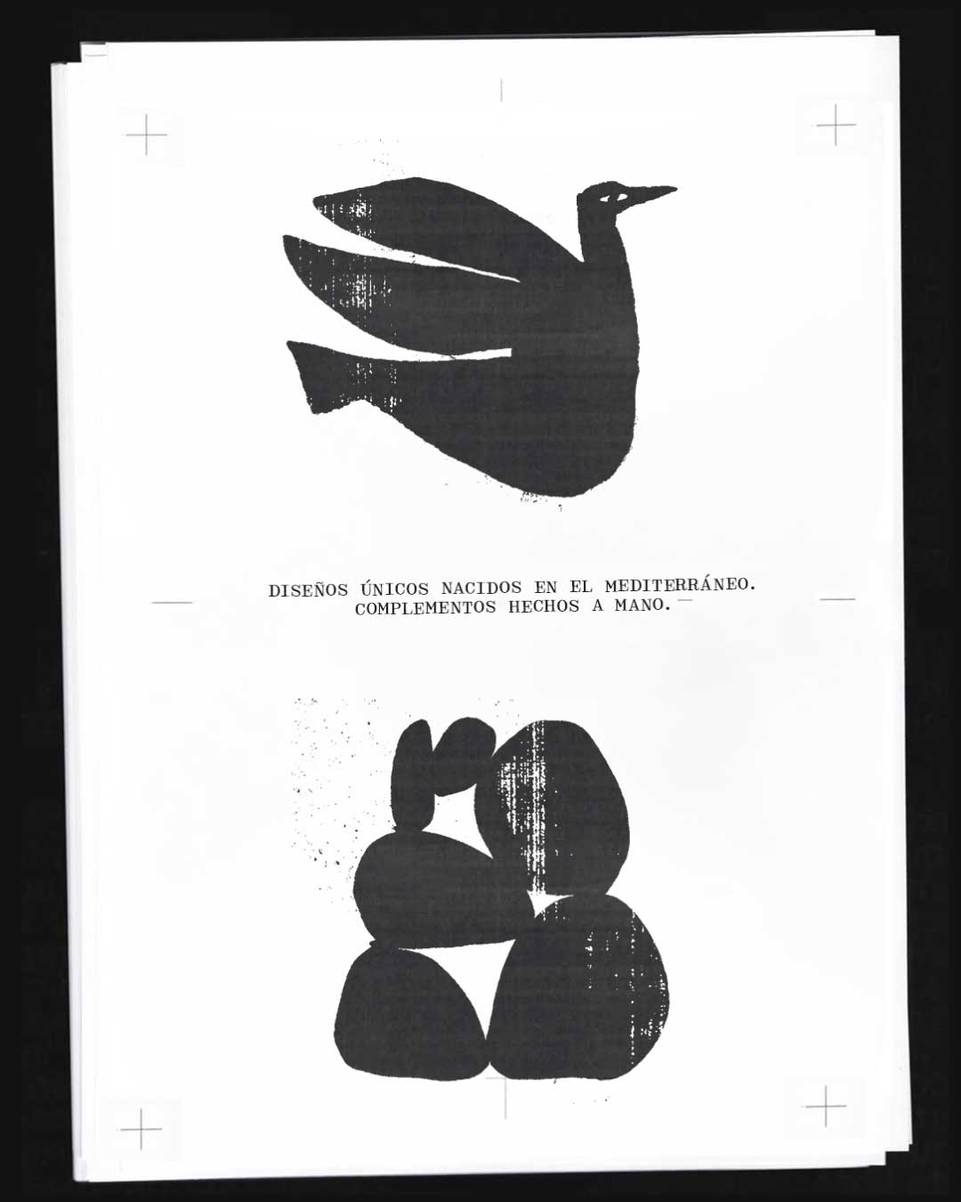
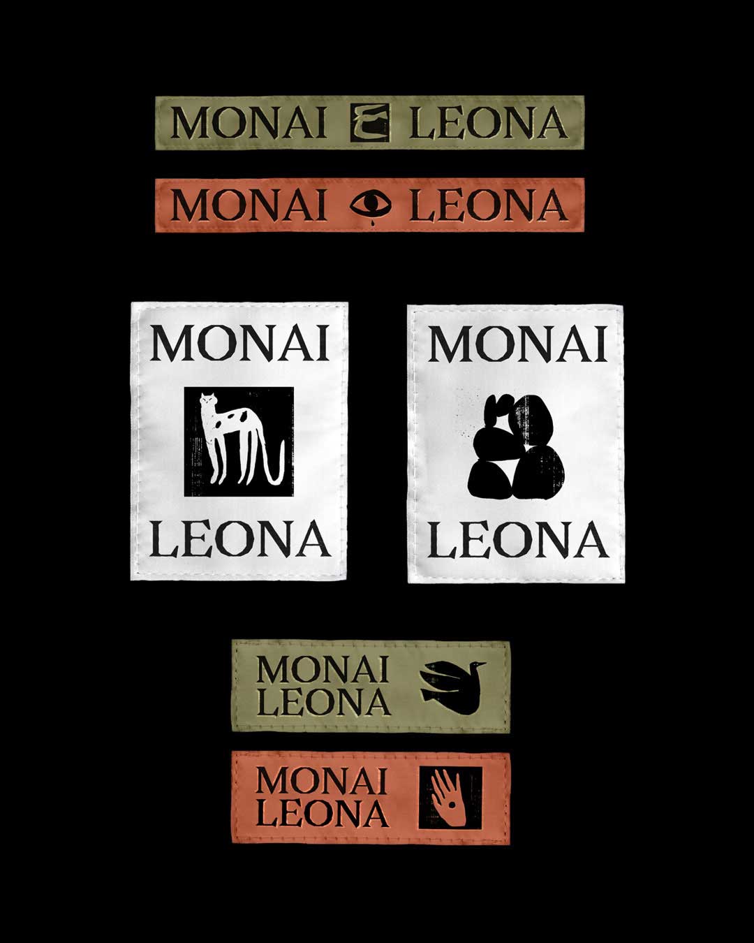
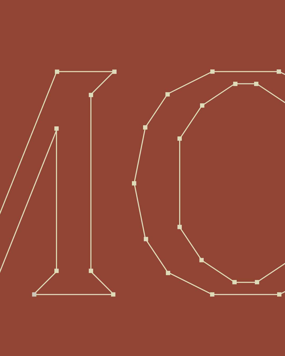
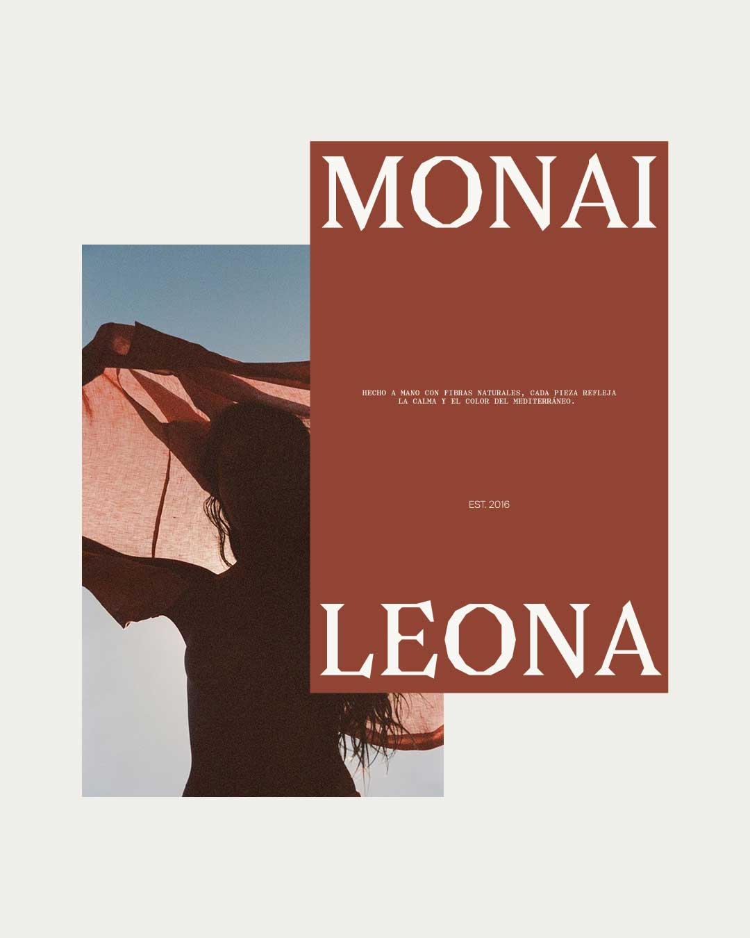
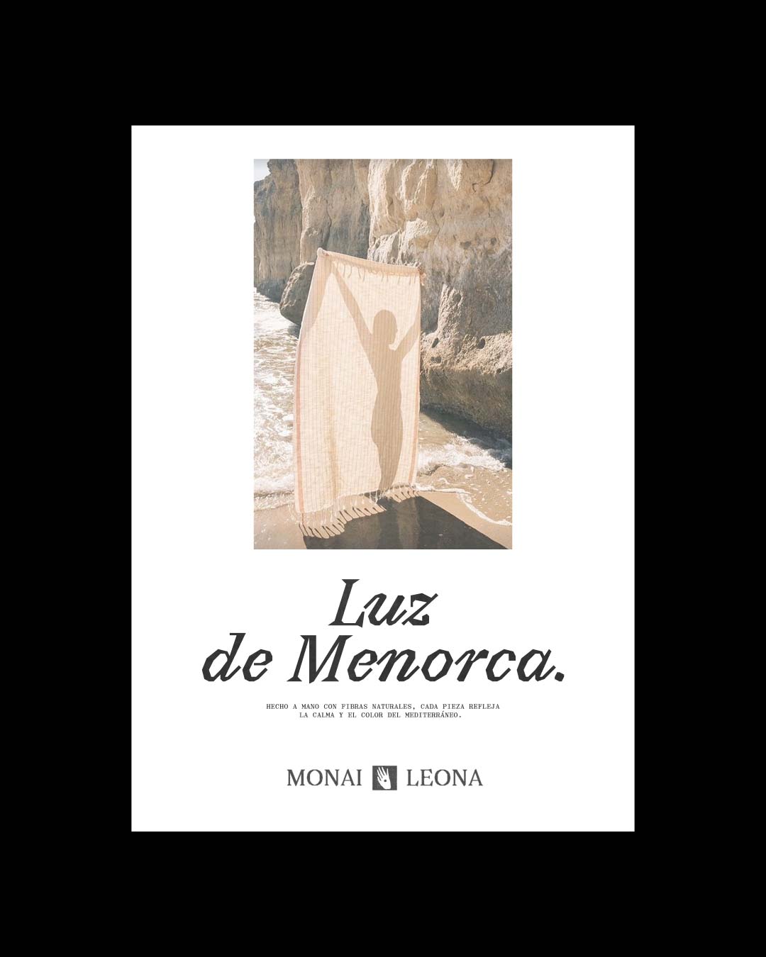
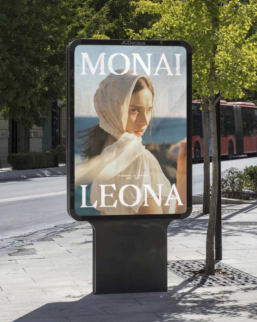
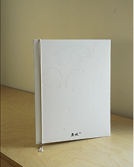
Identity for MONAILEONA, a head accessories brand based in Menorca.
The project develops a visual language rooted in the island's Mediterranean landscape, drawing from its
rocky
coastline and present nature - wind, ocean, flora and fauna. The elements inform a system focused on
texture,
movement, and light.
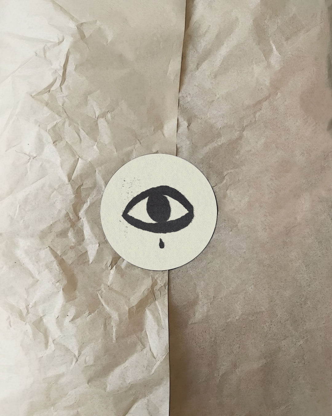
Illustrations by Eniko Eged are integrated as a core part of the identity, merging with the logo to
create a modular
system. The logo adapts fluidly across formats, shifting its composition and interacting with the
illustrations
depending on context.
The typographic system uses Avara by Raphaël Bastide, released through Velvetyne Type Foundry (2011),
introducing a
contrasting and expressive layer to the identity.
The result is a flexible visual system that brings together natural references and a contemporary
graphic approach.
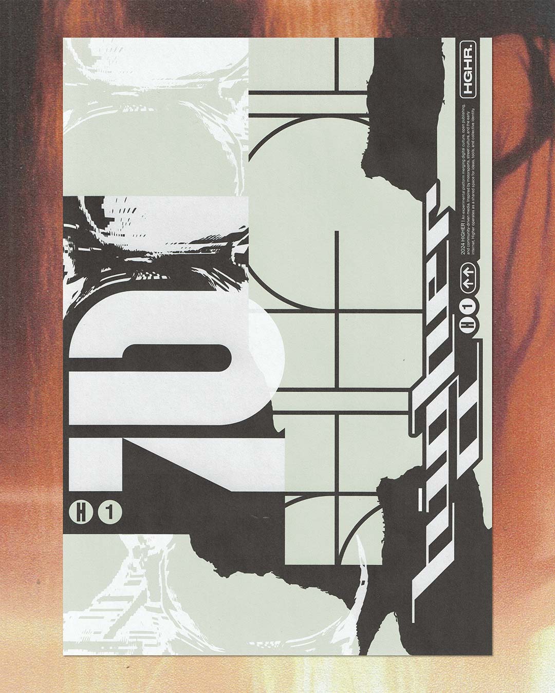
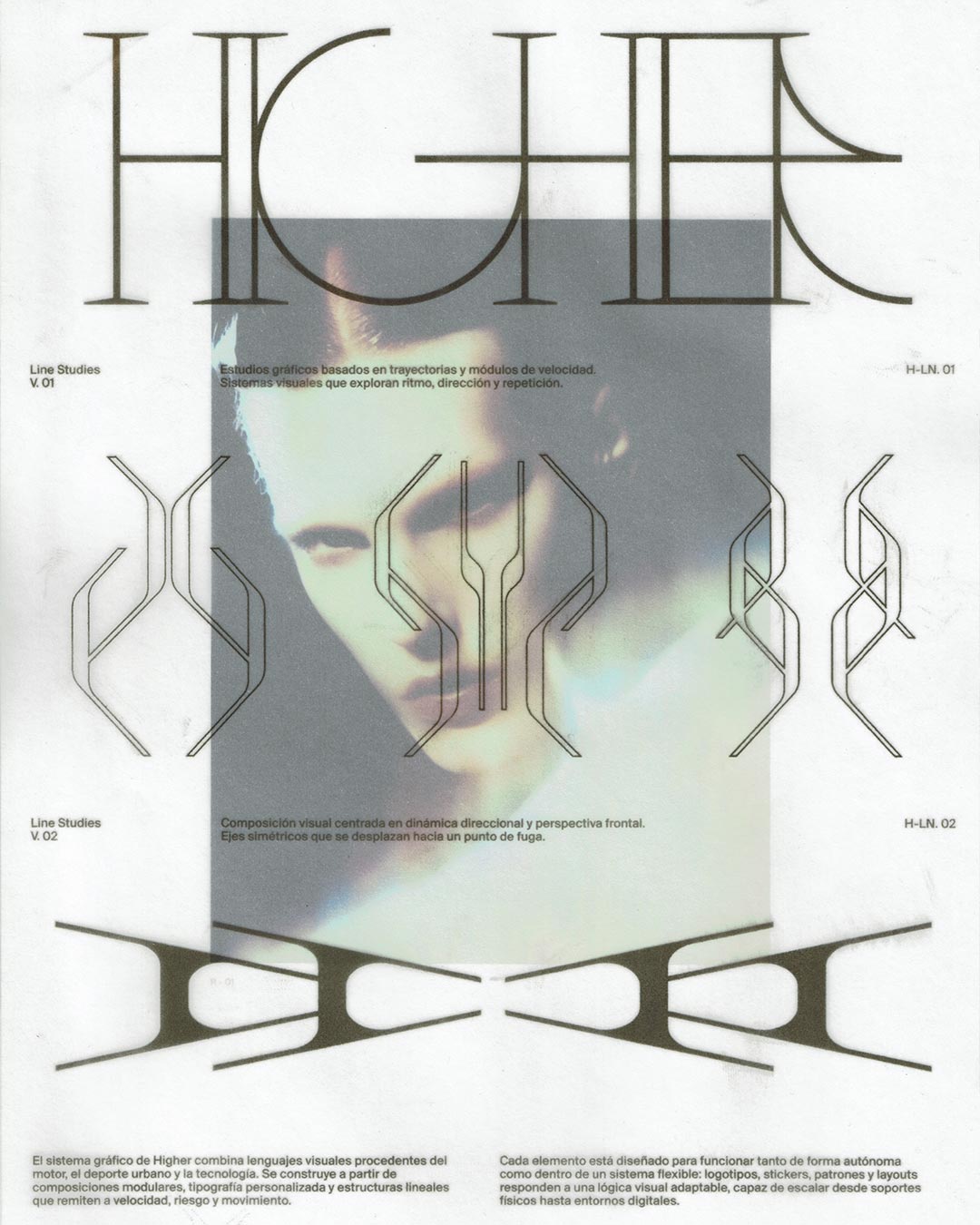
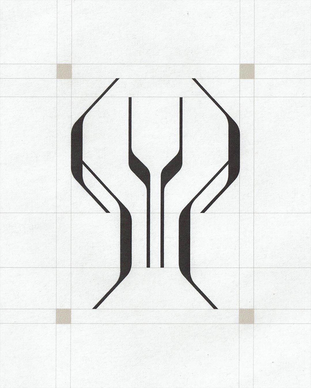
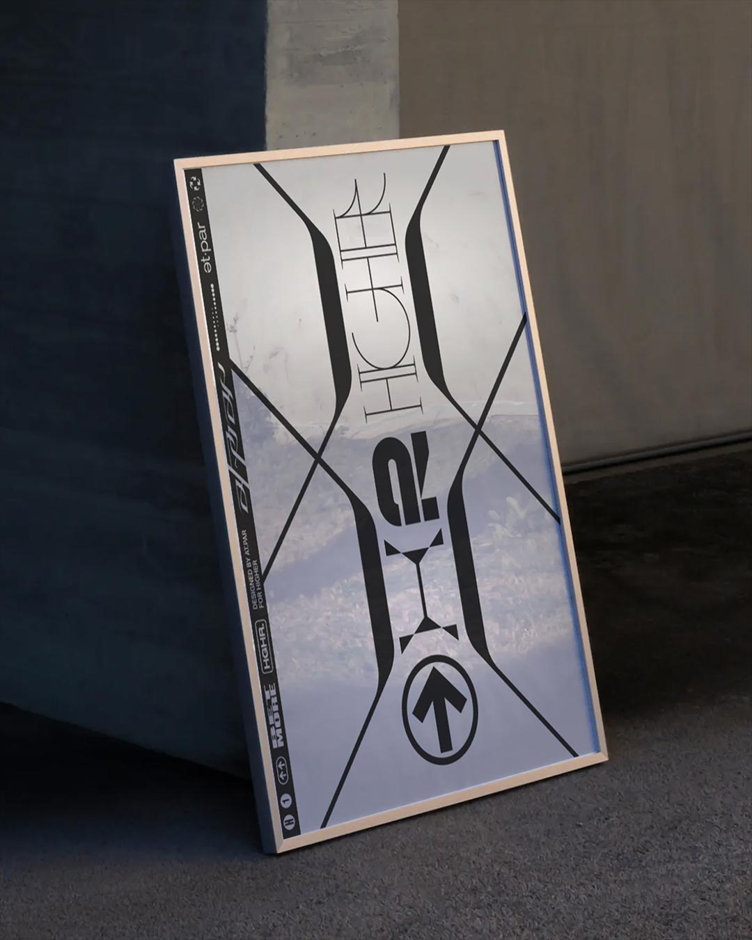
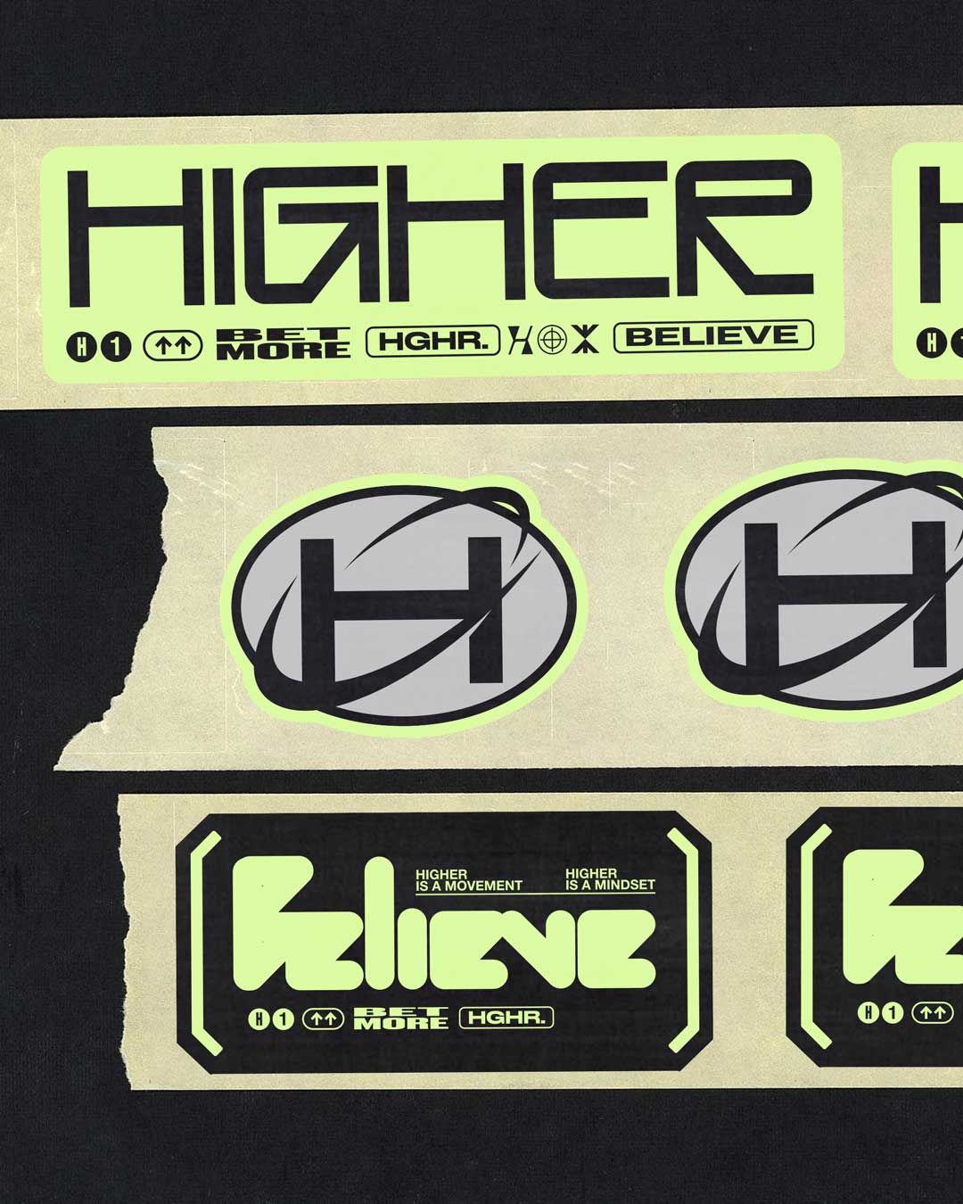
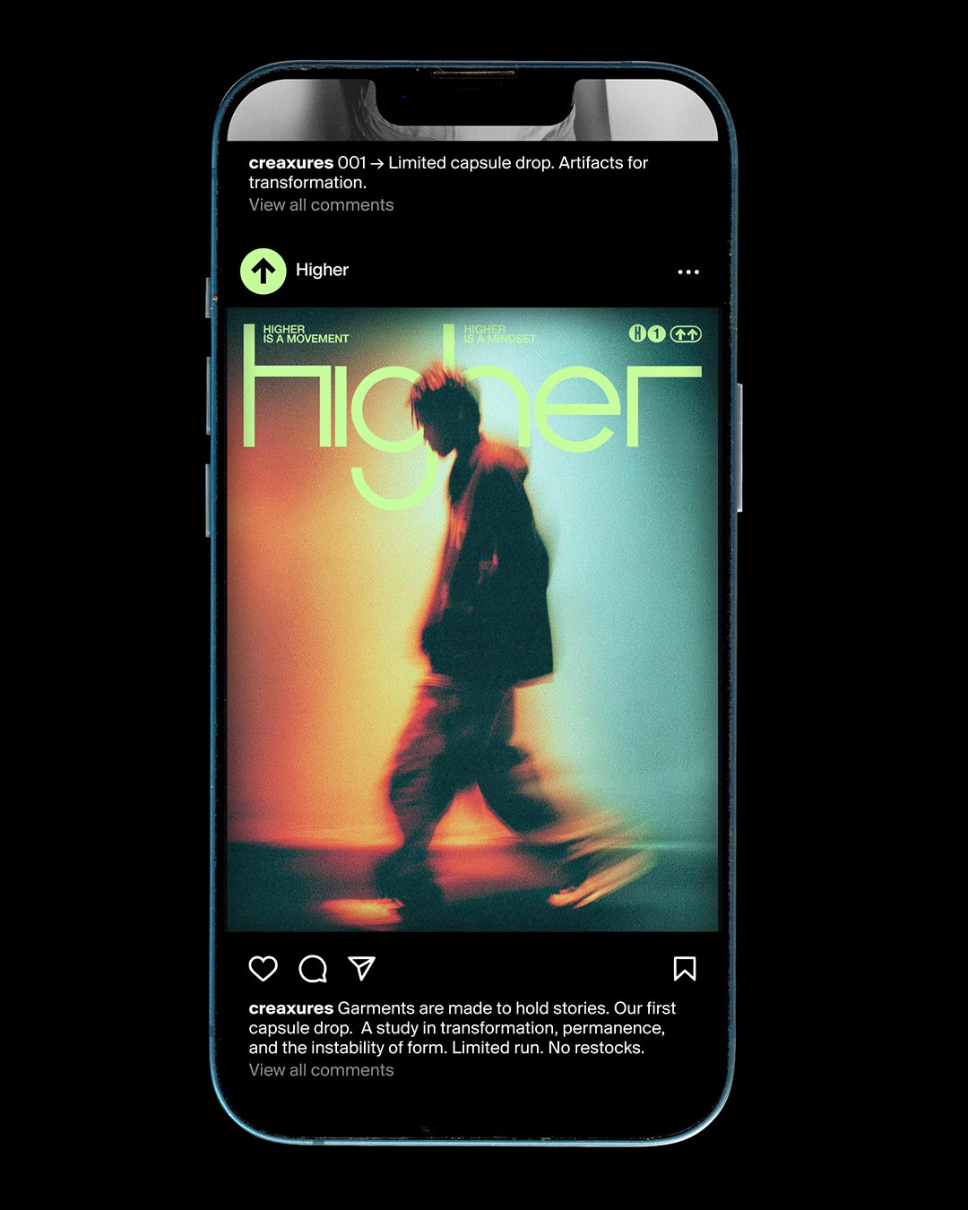
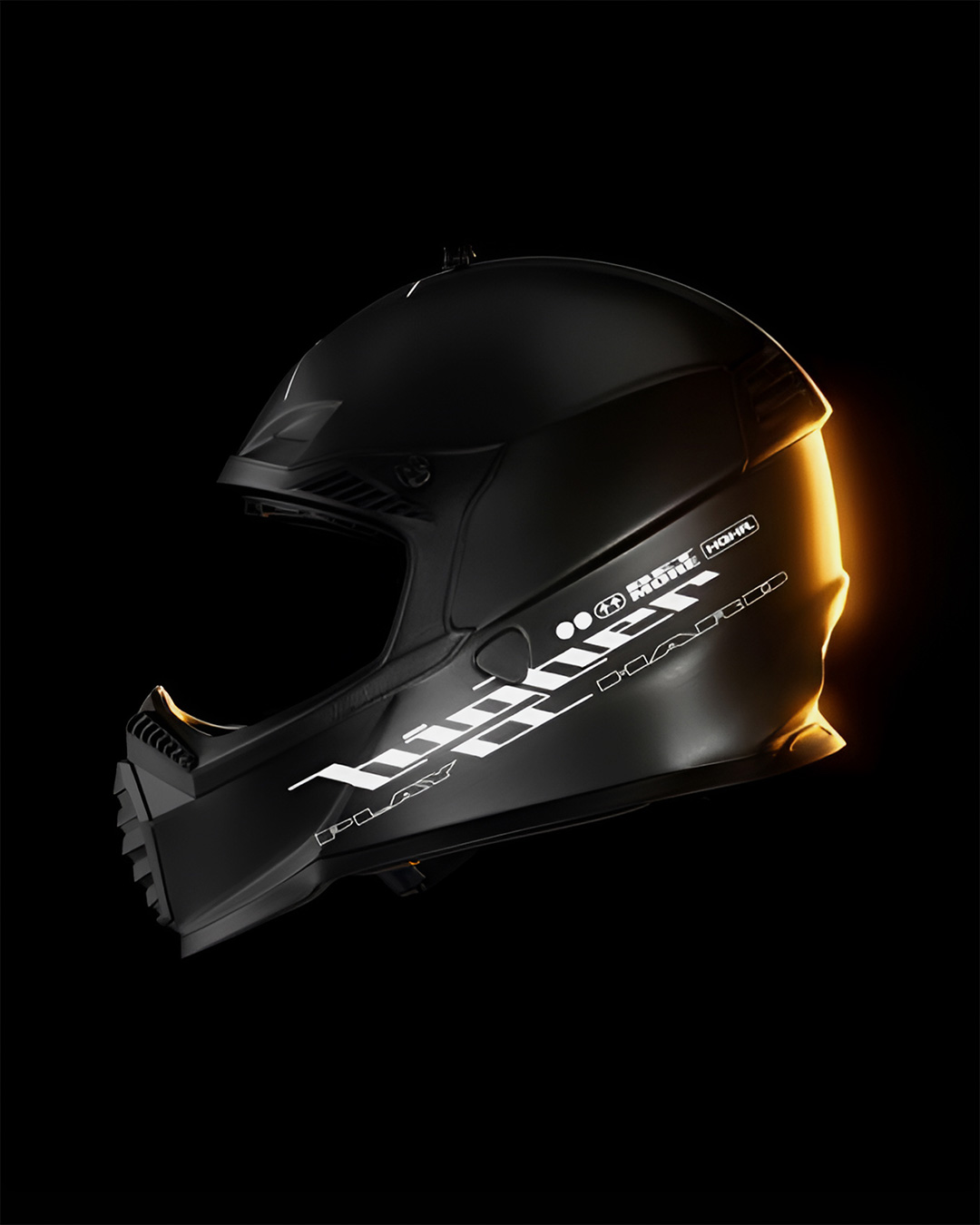
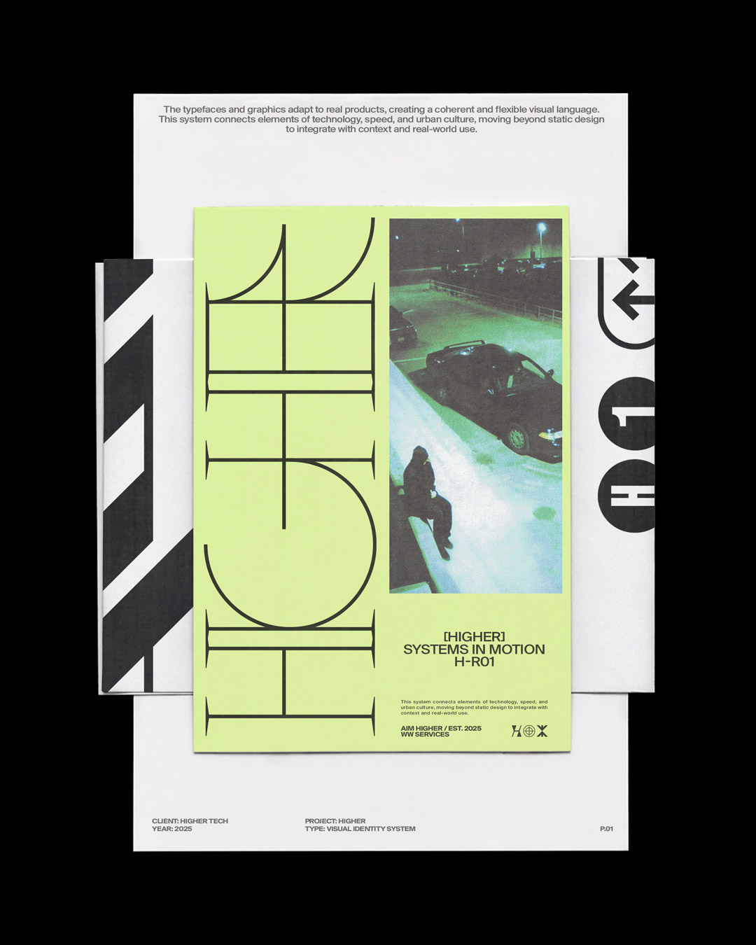
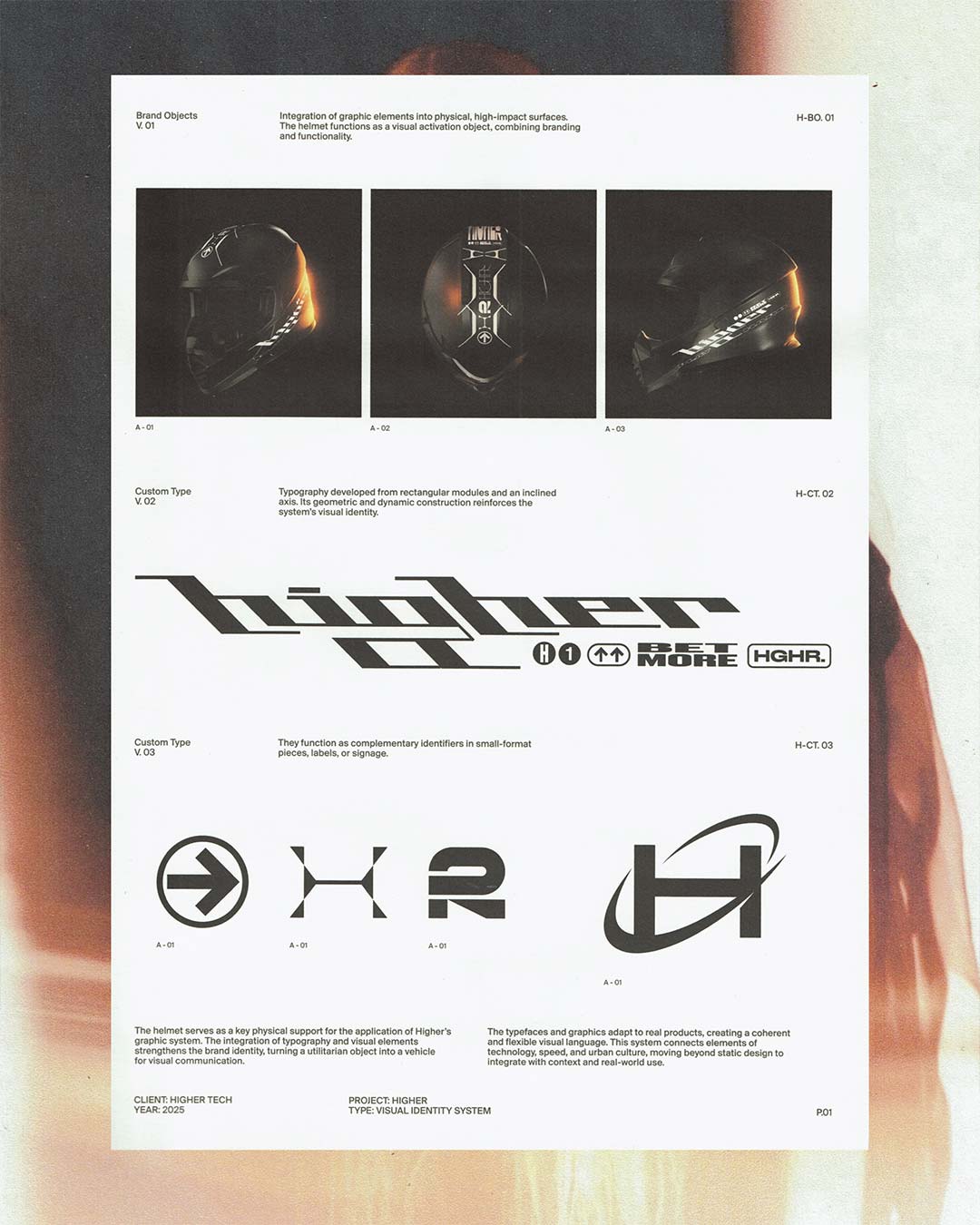
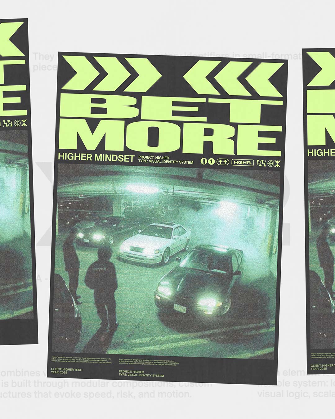
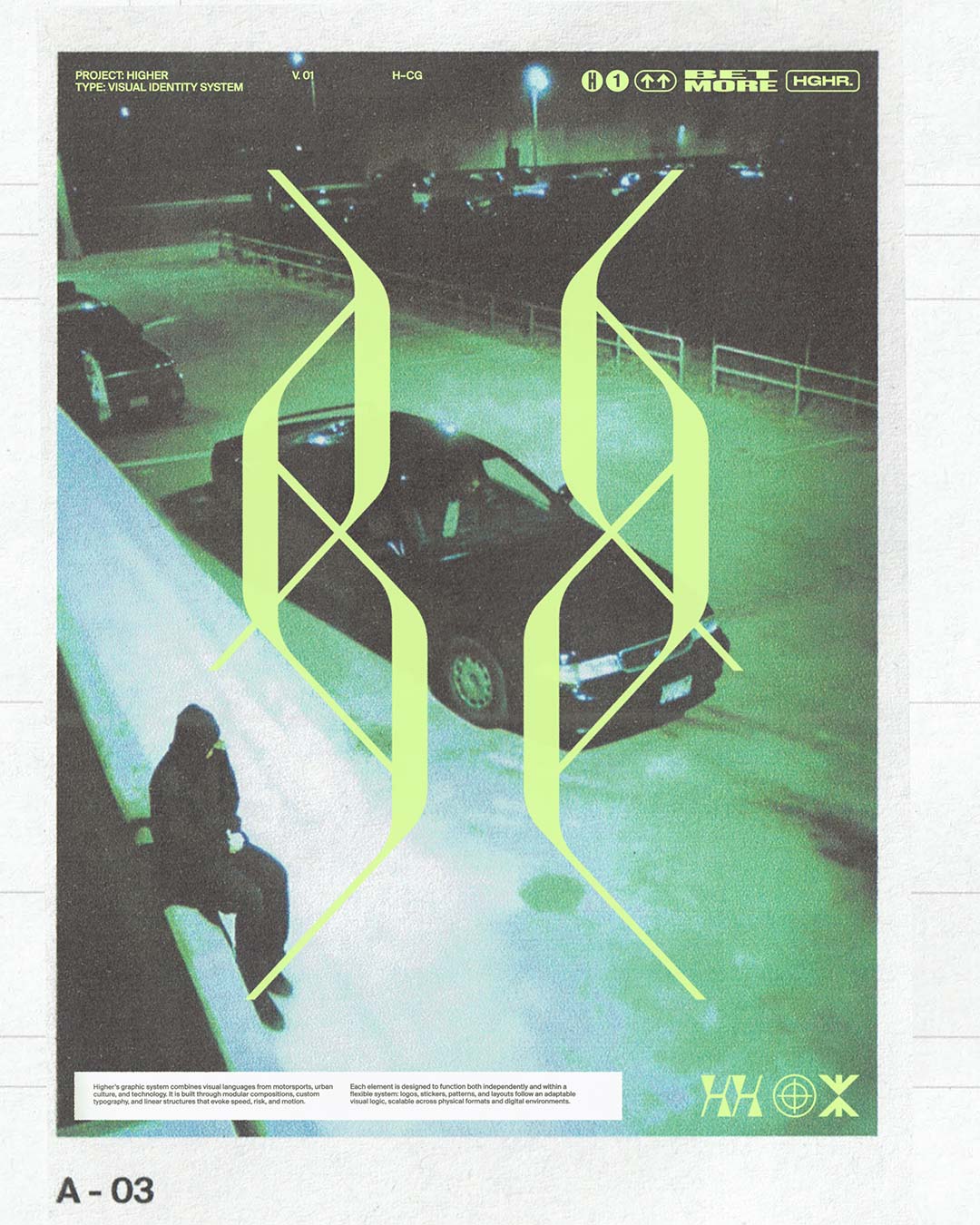
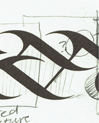
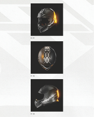
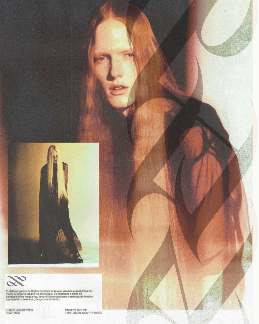
Visual identity and campaign for HIGHER, an experimental Web3 platform.
Higher is an online platform launched in March 2024, merging digital culture, open publishing, and
community-driven media into a shared ecosystem.
This project explores a typographic and lettering-driven approach, developing custom letterings,
symbols, and graphic elements based on the brand's language and slogans. Through iterative research, the
work builds a visual system that expands across multiple formats and applications.
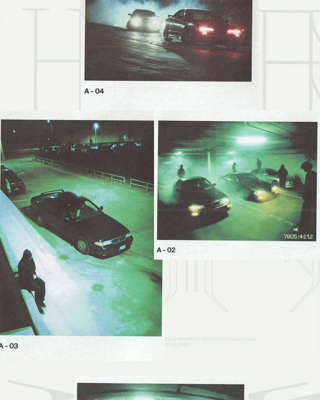
Drawing from underground racing culture, the art direction translates ideas of speed, risk, and motion
into a graphic universe defined by modular compositions and expressive typogrpahy.
The resulting campaign extends across posters, merch, and visual assets, forming a cohesive and
adapatable identity for Higher.
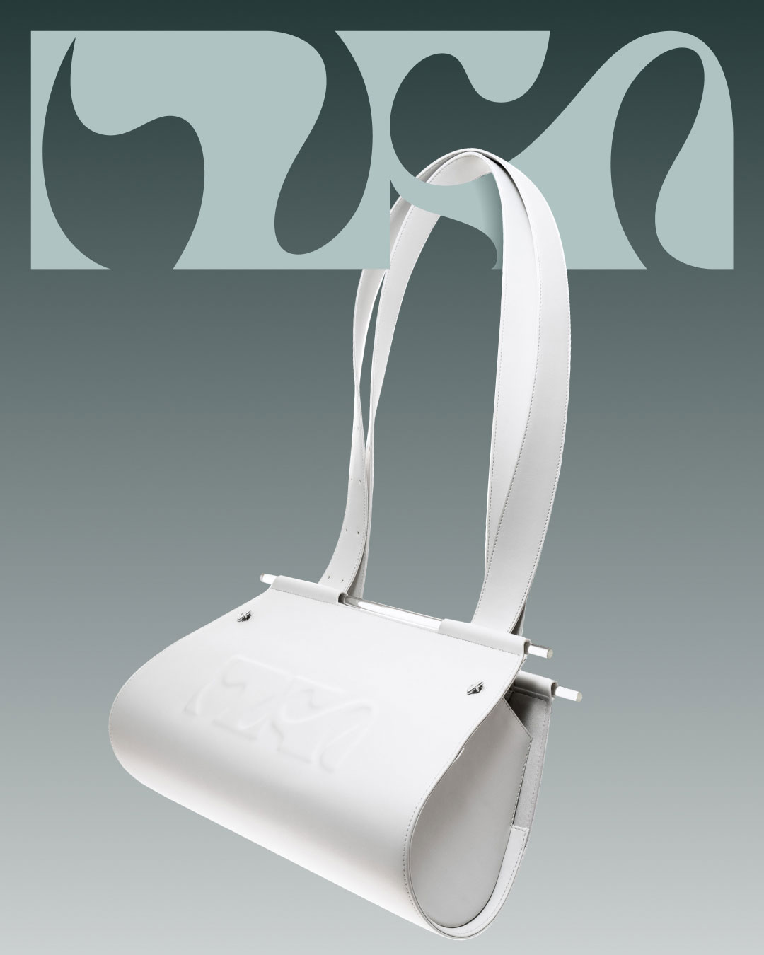
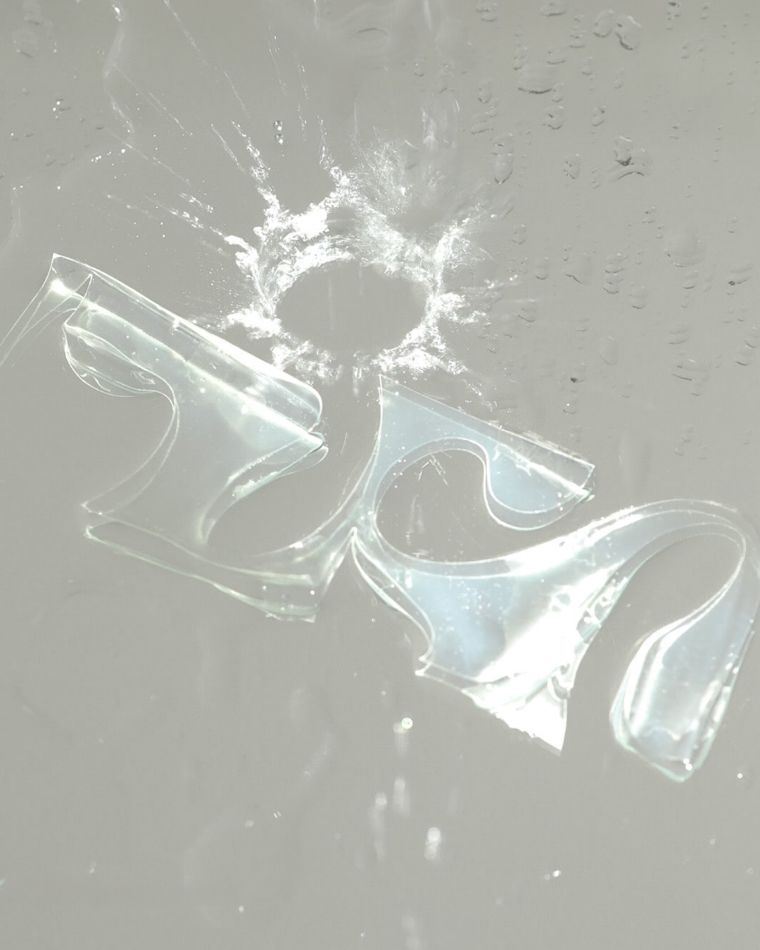
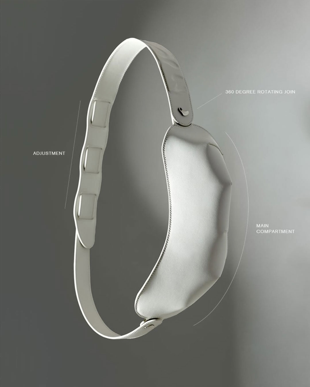
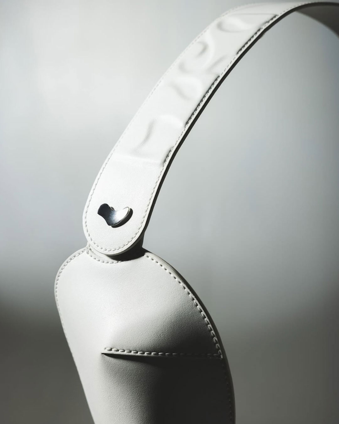
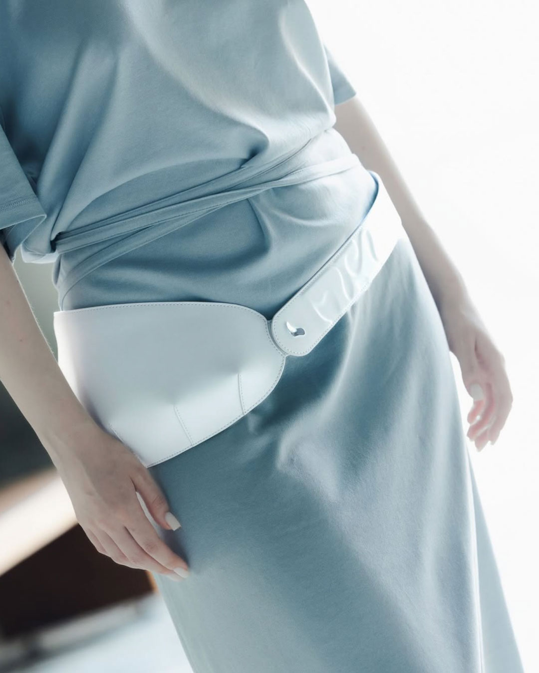
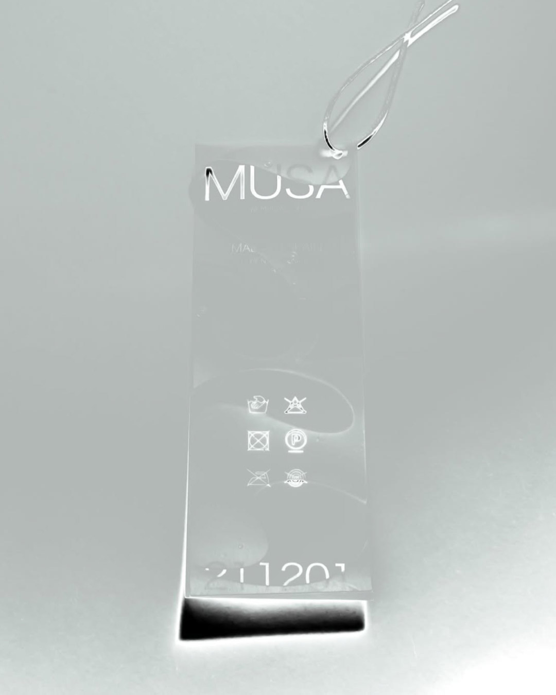
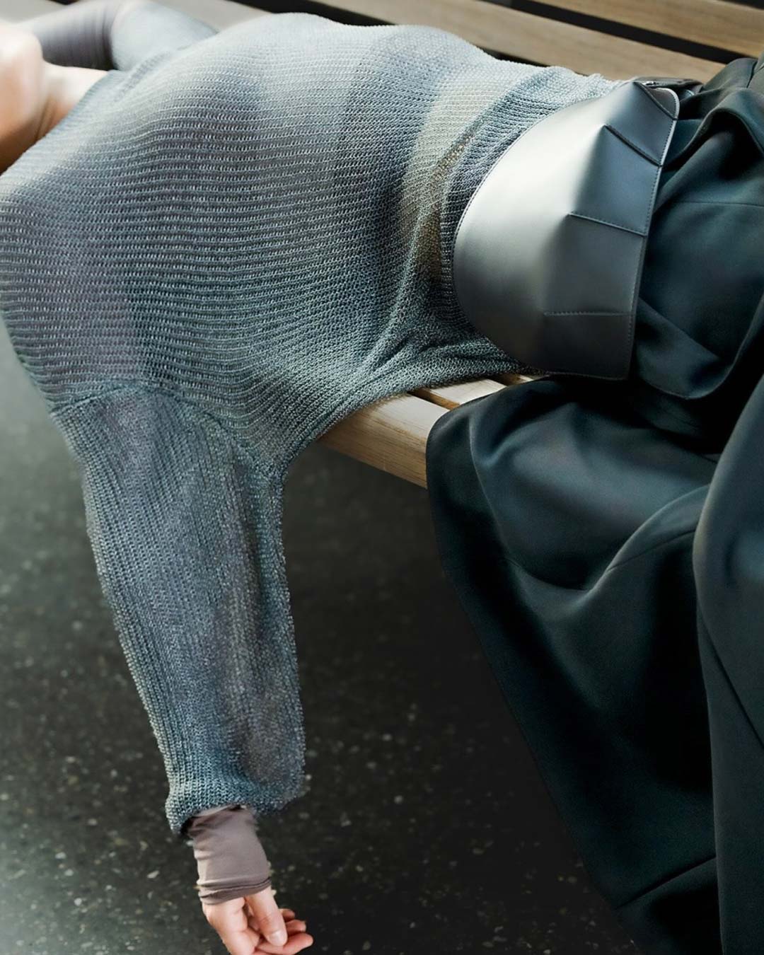
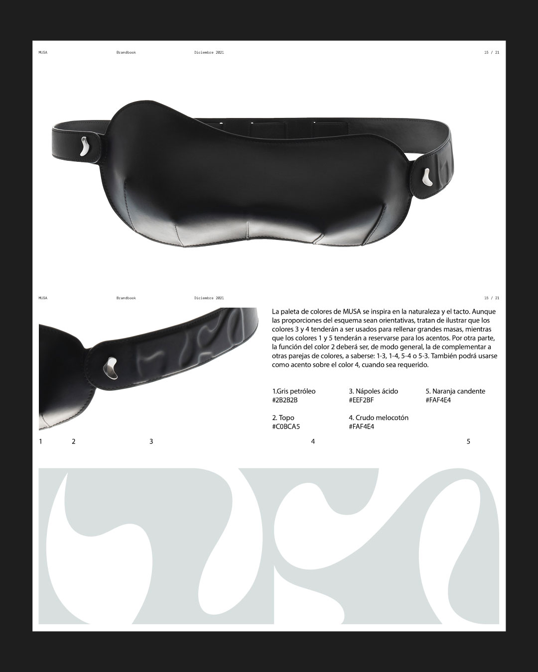
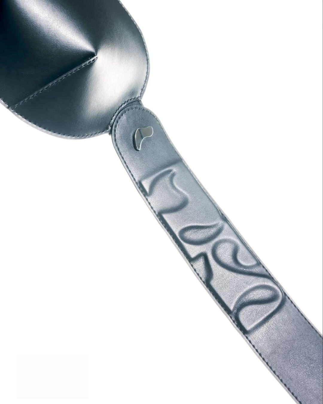
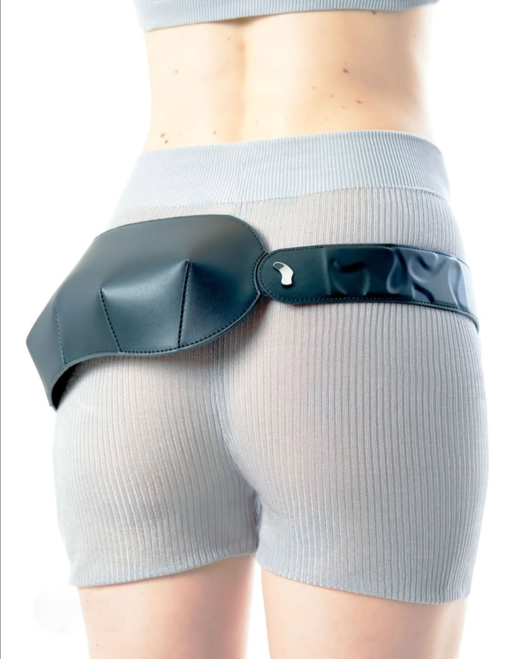
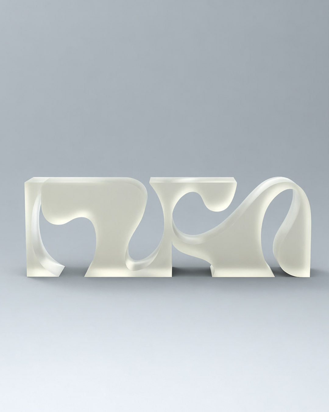
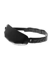
Visual Identity for MUSA.
MUSA is an accessories brand based in Madrid focused on redefining the
idea of daily carry - balancing functionality, aesthetic presence, and a more expressive relationship
between object and
body.
The identity is built around an experimental typographic logo, conceived through the
interplay of space, form, and counterform. It explores the relationship between inside and outside,
translating how each piece adapts to the body and occupies it. The result is a mark that feels
volumetric,
organic, and in constant dialogue with movement.
Parting from this concept, the visual system
emphasizes dualities such as hard and soft, straight and curved, full and empty, liquid and solid
—reflecting both the material nature of the objects and their functional behavior. The identity
positions MUSA as a brand that moves between craft and experimentation, where accessories are designed
not just to be carried, but to become part of the
wearer.